Training state view
The Training state mode answers one question: who needs my attention this week, and why.
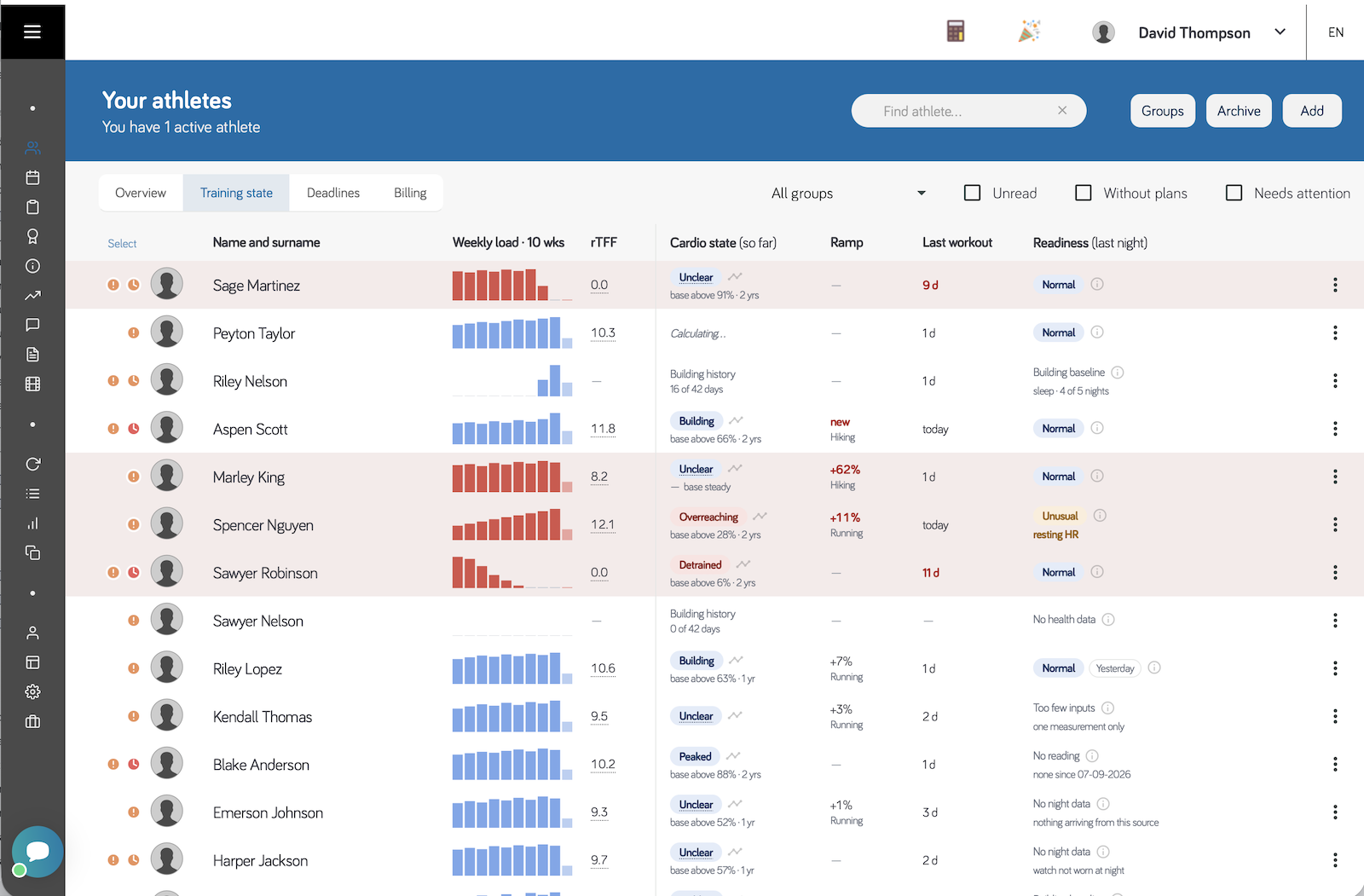
It puts ten weeks of training, the current fatigue balance, the athlete's cardio state and last night's physiology side by side for the whole roster, so the athletes worth opening announce themselves instead of having to be found.
What this view is, and what it is not
It is a triage list. That one question is put to the whole roster at once, and answered from the training you already have and, where a watch is connected, from last night's physiology.
It is not a ranking, a score, or an instruction. Nothing here compares one athlete with another, and nothing here decides today's session for you. Training fatigue can suggest backing off; nothing here ever clears a hard session.
| It answers | It does not answer |
|---|---|
| Who has drifted from what I expected of them? | Who is my strongest athlete? |
| What changed this week, and in which direction? | What should I write for Thursday? |
| Is what I am seeing in the training, or in the body? | Is this athlete ready to race? |
| Is there anything here I have not noticed? | Can this athlete go hard today? |
Three properties follow from that, and they are worth knowing before you lean on it:
- Every reading compares an athlete with themselves. Cardio state, rTFF and readiness are all measured against that athlete's own history, so two rows that look identical can be hundreds of AU and twenty heartbeats apart.
- Nothing is ever styled as an achievement. There is no green and no top grade, because the cheapest way to reach a good-looking reading is to stop sending data. Peaked and Normal are deliberately neutral.
- An empty cell always says why it is empty. A blank reads as fine. Every absence is named instead, and the names mean different things — some you wait out, some you fix today.
This view's job is finished when the right athlete is in front of you. What to do about them is yours, with everything you know that the app does not.
Who can open it
The Training state mode is shown to anyone in the club holding the View Analytics permission — the same permission that opens Reports. Without it the mode does not appear in the view switcher at all, and the athletes list behaves as it did before.
Athletes in the club never see it. The view reports on other people — including their sleep, their night heart rate and anything they have said about illness or injury — so it stays on the coaching side of the club regardless of what permissions an athlete has been granted.
What it needs to be accurate
Every column here is only as good as what reaches it, and the two halves of the row depend on different things. Where something is missing the view says so rather than guessing — but a cell that is filled can still be built on a placeholder, and that is the case worth knowing about.
| For | It needs |
|---|---|
| Weekly load · rTFF · Cardio state · Ramp | Completed workouts carrying heart rate — a file from a watch, or an average heart rate entered on the completion |
| The athlete's maximum and resting heart rate in their Performance Data — see cardio load for how much they matter | |
| 21 days of history before rTFF appears, 42 days before cardio state does | |
| Readiness | A watch connected, or health import switched on in the athlete's mobile app |
| The watch worn overnight — readiness reads night HRV, night resting heart rate and sleep, none of which exist from a watch charged at night | |
| 14 nights of HRV and resting heart rate, or 5 nights of sleep, before there is a baseline to compare against |
Cardio load is built on heart-rate reserve — where the session sat between resting and maximum — and it rises as a steep power of that fraction, not in step with it. So the two numbers in Performance Data do not nudge the result by a few per cent; they scale it, and every figure downstream with it: rTFF, cardio base, cardio form, the ramp and the weekly bars.
Where they are not set the app estimates them, from the athlete's age and their own highest observed heart rate — deliberately, because the alternative is worse. But an estimate is what it stays, and an athlete with the real values entered is being read more accurately than one without.
Two things that are often assumed to belong here and do not: a 10 km race time drives pace zones rather than the cardio load, and a completion with no heart rate at all falls back to duration times perceived effort — which carries no intensity signal if the athlete did not rate the session.
Strava passes activities and no health data at all, so the column will always say No health data. Overnight measurements reach the app from Garmin, COROS, Suunto, Polar or Apple Watch — see health import.
The columns
| Column | What it shows |
|---|---|
| Weekly load | Ten weekly cardio load totals as bars |
| rTFF | Relative fatigue — this week's load against the last three weeks. Highlighted when it runs above its band. Empty for an athlete's first three weeks |
| Cardio state | Where the athlete sits between fresh and buried, with the comparison behind it |
| Ramp | The steepest weekly rise in structural load, and the sport it is in |
| Training fatigue (predicted) | Days since the last workout, and what recent training has left behind: Normal, Easy day or Recovery day, with the day the load is back to normal |
| Readiness | How last night's physiology compared with that athlete's own recent normal |
The divider
A vertical line separates rTFF and the bars from Cardio state and the Ramp.
That line is not decoration, but what it marks is a difference in how the two halves are produced, not in which day they describe. Both sides are calculated up to now, and both move during the day as workouts arrive.
What differs is cost. Most columns are read from a fixed recent window and are always current. Cardio state, Ramp and Training fatigue are the exception: they are rebuilt from the athlete's whole history, so they are cached — after a session arrives, they can briefly read Calculating… before the new value appears. The line marks where that half begins. Readiness sits past it for layout reasons and is as live as the bars.
Because both sides are calculated up to now, neither is final until the day is over: a value read in the morning assumes the athlete does nothing more that day. Hovering the Cardio state heading tells you the day its value is for.
Weekly load bars
Ten bars, one per week, ending with the week in progress. Bar height is relative to that athlete's own ten-week peak — so the bars show the shape of their training, not how they compare with anyone else. Two athletes with identical-looking charts can be hundreds of AU apart.
Three kinds of empty, and they mean different things:
- A pale last bar — the current week, still incomplete. It is not a collapse; it is Tuesday.
- A hairline — a week inside their history with no training in it. A genuine zero.
- A faded hairline before the first bar — before this athlete had any history with you at all.
A legend under the table repeats this.
Cardio state
A label, not a number — because cardio base and cardio form are not comparable between athletes. An athlete with a large base swings further in both directions, so their raw numbers say nothing next to someone else's. What does compare is where they sit against their own history.
| Peaked | Fresh, on a base that is holding up |
| Building | Absorbing training — where most of a build is spent |
| Detrained | Fresh because the base has eroded, not because of a taper |
| Overreaching | Carrying more recent cost than the base supports |
| Unclear | The evidence does not separate two opposite readings — see below |
| Building history | Fewer than 42 days of training, so there is no cardio form yet. The cell counts the days |
Under the label sits the comparison it rests on: a percentile against their own history with the window it covers (base above 93% · 2 yrs), or, before that percentile exists, the direction the base is moving (↗ base +6%/wk).
A high freshness reading has two opposite causes: a taper that worked, or an athlete whose training — or whose data — stopped arriving. The load model cannot tell them apart, which is why Peaked is styled neutrally, never as a success, and why the days since the last workout sit nearby, in the Training fatigue column. If an athlete has not trained for a week, the app withdraws Peaked and shows Unclear instead: silence cannot support the claim.
Unclear is an honest answer, not a failure. It appears when the athlete sits mid-pack against their own history, or when their base is steady while they read fresh — a state that could be a taper or an early decline, and the app will not guess. Hover the badge and it tells you which of those it is; if the athlete has also not trained for a week, it says that instead, because that is the one a coach can act on.
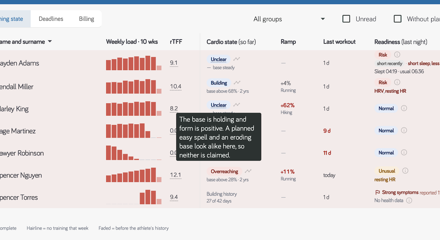
The tooltip names both readings and declines to choose between them. That refusal is the feature — the alternative is a badge that guesses, and a coach with no way to tell the guess from a measurement.
Why rTFF is empty for a new athlete
rTFF divides this week's load by what the last three weeks built. For an athlete whose history is shorter than those three weeks, the bottom of that division is mostly days before they joined — so the number is not a comparison, it is an artefact of the missing weeks, and it comes out enormous. The column stays empty until the athlete has 21 days of history, for the same reason a bar is faded rather than drawn at zero for a week before they joined: an absence of history is not a reading.
The same holds one step in. An athlete with twenty-one real days behind them but only a token of training in them has a denominator that is real and tiny, and dividing by it produces a large number rather than a large stimulus — on a real squad one athlete reading 23.4 had done a single AU that week. Below about 50 AU a week the column stays empty too, for the same reason: a base that small is not something this week can be a multiple of.
Once past that, an athlete returning from a long break will read high, and that is correct — a session after three weeks off genuinely is a large stimulus relative to the base underneath it.
Opening a chart
Two of these columns open into ten weeks of their own, so you can check a reading without leaving the list for Reports.
| Click | What opens |
|---|---|
| The rTFF number — underlined to show it is clickable | rTFF over the last ten weeks, with the 8–13 band drawn as shading behind it |
| The chart icon in the Cardio state cell | Cardio base and form over the same ten weeks, on one shared axis |
Base and form share an axis deliberately: form is base minus recent fatigue, so on one scale the gap between the two lines is the fatigue the athlete is carrying, and the point where form crosses zero is a real event rather than a coincidence of two scales.
That is also what makes the pair readable where the badge alone is not — form above zero while the base holds is a taper; form above zero while the base falls is lost fitness. Both draw the same Peaked.
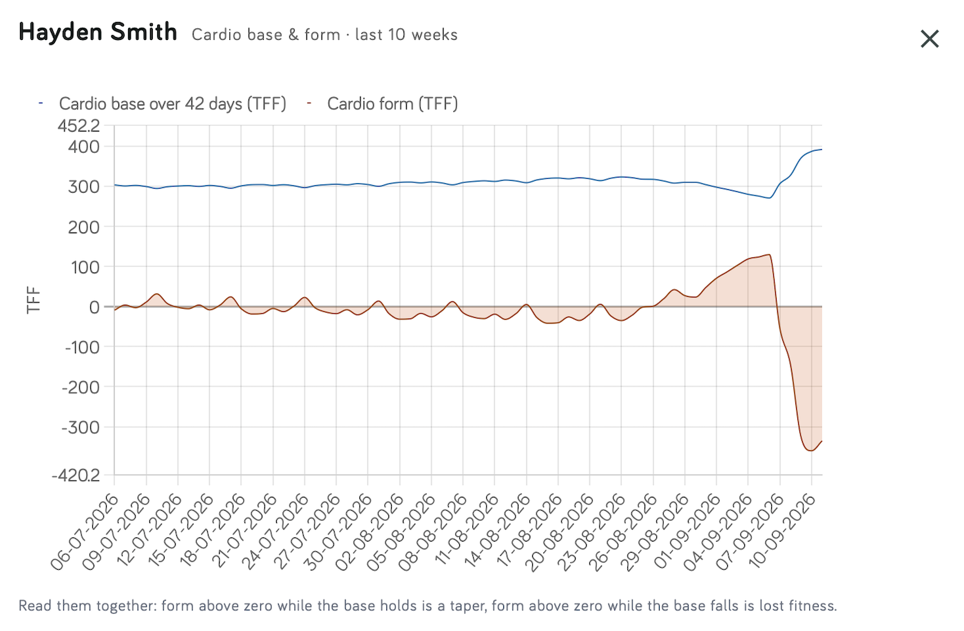
Read left to right: eight weeks of training with form wobbling either side of zero, then a taper — form climbing to +128 while the base eases back — and then a six-day stage race that takes the base to its highest point of the ten weeks and form to −335. Because the two share an axis, the widening gap on the right is the fatigue that race put into the athlete.
The taper is the part worth studying, because the two readings named under the chart sit closer together than they sound. A taper does pull the base down — cutting load lowers a forty-two-day average, and this one takes it from 320 to 271. What separates it from lost fitness is not the direction but how far and for how long: a taper's dip is shallow, brief, and reverses the moment training resumes, which is exactly what the right-hand side shows.
On the rTFF chart the shaded band is where the week's load matches what the last three weeks built. Above it the stimulus is greater than the base supports; below it the athlete is recovering — or losing fitness.
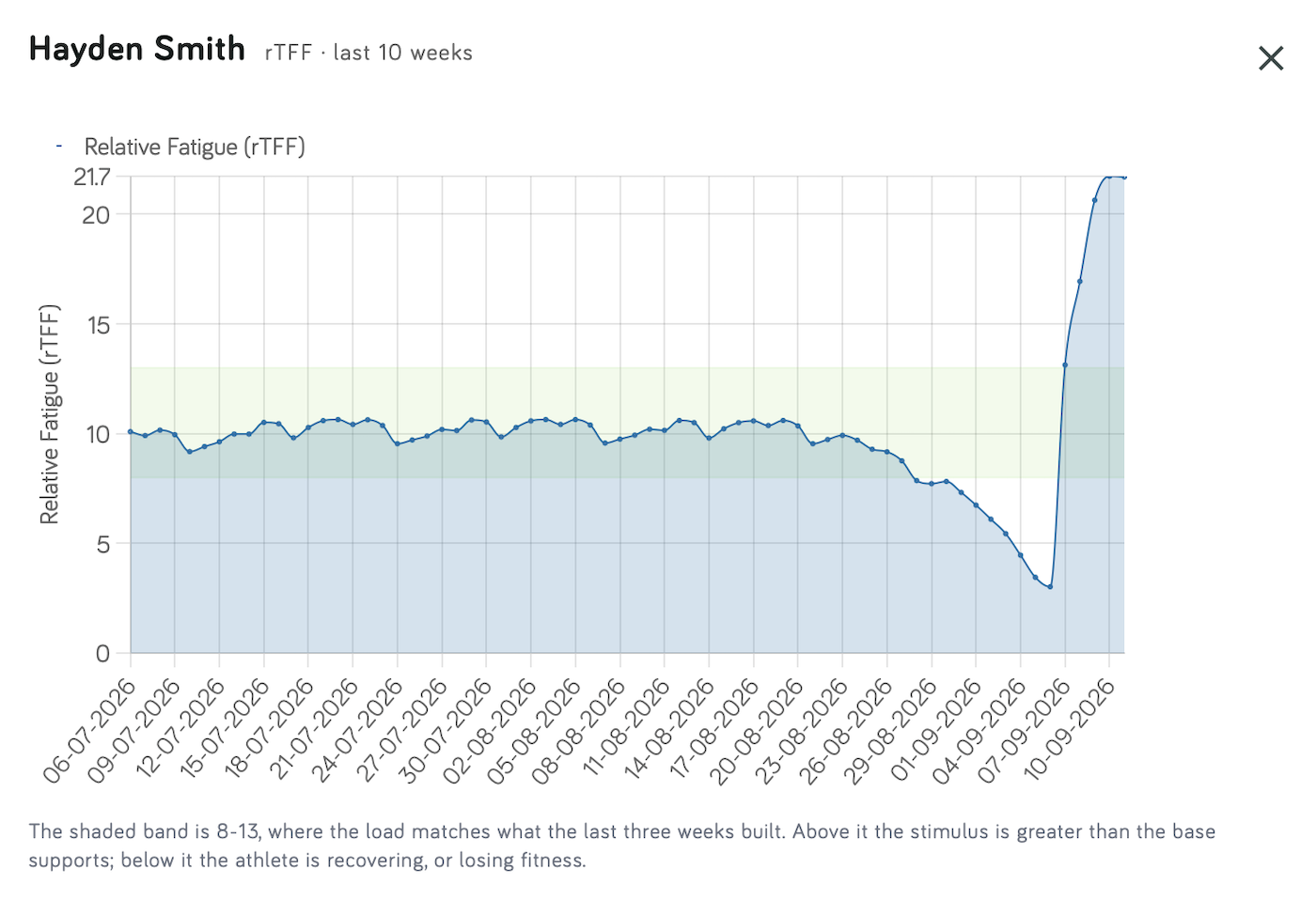
The sawtooth through the first eight weeks is the training week itself — a hard weekend lifts the acute side of the ratio and the easy days after it settle it again — so an rTFF line is never smooth, and is not meant to be. What matters is where the run of peaks sits against the band, not any single day inside it.
Then the shape changes twice. The line slides out of the bottom of the band to 3 as the athlete tapers, which is the taper working: this week's load falling away from what the last three weeks built. Days later it leaves the top at 21, which is a six-day stage race. Both are correct, and neither is a state you would want smoothed away.
This athlete's line leaves the band at both ends, so both edges are drawn. The axis scales to the line, so on an athlete who never goes near 13 it stops below the upper edge and the shading marks above 8 rather than the whole band.
Ramp
The structural load ramp: this week against the average of the four weeks before it, for the sport where it is steepest, with the sport named underneath.
Structural load is tracked per sport because tissue adaptation is movement-specific — a road-to-trail switch can leave total load flat while the loading on bone and tendon rises by half. A combined figure would hide that entirely.
Which sports are considered follows, in order: the sports set for that athlete in your club, then your own main sport types from Preferences, then the athlete's own. So a coach who coaches running and cycling does not get a column narrating a walking ramp.
The column stays empty when nothing is rising. A decline is not a ramp — that an athlete is doing less is already said by the bars, by the days since the last workout and by a Detrained state. Above the 10% rule the figure is highlighted; below it, it is shown quietly.
When an athlete takes up a sport, the column says new instead of a percentage. There is nothing to compare a first week against, and a percentage there is not a large number but a meaningless one — an athlete with a trickle of auto-detected walking behind her and then one real mountain week once read +25396%. She had not ramped her hiking; she had started hiking, and new is the honest word for it. What counts as essentially nothing differs by sport — structural load is measured on a scale where a running week runs tens of times a cycling week, so a base that is negligible for one is ordinary training for the other, and each sport is judged against its own. This only applies when the previous four weeks hold essentially nothing and this week is more than ten times it: a genuine tenfold rise from a base that actually exists keeps its number, because that is the loudest thing on the row.
A high ramp beside a positive cardio state is the case this column exists for. A mountain week lowers heart rate, so cardio load falls and the athlete reads fresh, while structural load is the highest all year. Read alone, the card says peaked and the legs are wrecked.
A high ramp during a build, with cardio state Building, is ordinary and is deliberately not flagged.
Training fatigue
What recent training has left behind, and whether that makes today an ordinary day for the athlete: Normal, Easy day or Recovery day. It is a prediction from training load — the heading says (predicted) — and it sits right beside Readiness, which says what last night actually measured.
For example, 2d · Easy day, with 3d · normal from Thu underneath: the last workout was two days ago, today is best kept easy, and the load from recent training should be back to this athlete's usual level from Thursday.
| The cell shows | Means |
|---|---|
| 2d, today | Days since the last completed workout, highlighted once it reaches a week. It counts days since the workout — a different count from the number underneath |
| Normal (neutral badge) | Recent training has left nothing beyond what this athlete usually carries |
| Easy day (teal badge) | More left over than usual. A planning hint — not the day for the hard session |
| Recovery day (red badge) | Clearly more than usual: the load suggests rest, or a recovery session |
| 3d · normal from Thu | Days until the load is back to the athlete's usual level, if they do nothing more until then. Shown only when tomorrow is not an ordinary day yet |
| ⓘ | Cardio, muscular and structural load, each with its own verdict |
| No load data | Most sessions in the last 42 days carry neither heart rate nor a rating of effort, so there is no load to predict from |
| Calculating… | Not computed yet — it fills in within a few seconds |
How it is worked out
- Every session adds to a fatigue level that fades each night — within a couple of days for cardio and muscular load, over a week or more for structural load.
- It is measured against what this athlete habitually carries, so an athlete who usually trains more clears the same session sooner than one who trains less.
- Sessions add up. A hard day on top of yesterday's hard day counts for more than either one alone, and two easy runs in one day count together.
- The heaviest load decides. A long mountain descent can be easy for the heart and still make the next day a recovery day for the legs; the ⓘ shows which.
- It needs 42 days of history. Before that the cell shows only the last workout.
- Everything in the cell is the state now. Today's completed sessions are already in it: before the athlete trains it shows how they woke up, and after a hard session it can no longer say Normal. A session done in the evening can move both the badge and the line underneath.
Read it on examples
These are what the cell might show for an athlete who usually trains about an hour a day. The exact days depend on the athlete; the shapes are what to recognise.
The long run. Sunday reads Normal until a 2½-hour run arrives in the afternoon; by the evening it reads Recovery day, 3d · normal from Wed. That is not a verdict on Sunday — the run was planned and it is done. It is what the run leaves behind: Monday a rest or recovery day, Tuesday easier than usual, an ordinary day from Wednesday. A jog on Monday moves Wednesday later.
Two hard days in a row. Intervals on Tuesday or a tempo run on Wednesday would each leave the next morning Normal. Together they make Thursday an Easy day, sometimes a Recovery day — the second session lands on what the first one left.
The mountain day. A long descent on Saturday kept the heart rate low, so the cardio load is ordinary, but the legs took the heaviest load of the month. The cell reads Recovery day, and the ⓘ says why: cardio Normal, structural Recovery day. Structural load fades over a week or more, so the line underneath can run into the next weekend — even when the athlete feels ready to run hard by Tuesday.
A recovery day after a good night. Recovery day here and Normal in Readiness, typically the morning after a race. It is not a contradiction: this column reads the work done, Readiness reads one night. A good night does not undo the load — plan the day as a recovery day anyway.
What it does not say
- It knows nothing about sleep, illness or stress. That is what Readiness is for. The row worth noticing is the disagreement: Normal here and Risk in Readiness means something other than training is going on.
- "Normal from Thursday" describes the load, not permission for a hard session. Readiness — and the athlete — can still say otherwise.
- Only Recovery day is backed by measured data. Checked against our athletes' overnight readings: on mornings the model called a recovery day, Readiness read Risk about twice as often as on normal mornings. Easy day showed no measurable effect, so treat it as a planning hint.
- It does not raise Needs attention. A recovery day most often follows the long run or race you planned, and a filter full of planned rest is one you stop opening.
Simplifications to keep in mind
- "Normal from Thursday" assumes nothing more until then. It counts mornings without further training. Any session in between, even an easy one, adds to the load and can push the date later.
- Everyone fades at the same rate. Cardio and muscular load lose half their effect in about a day and a half, structural load in about a week, for every athlete. Age, sleep and how quickly this athlete really recovers are not in it — you know those better than the model does.
- The thresholds are the same for everyone. Easy day and Recovery day mark how far above their own usual an athlete is, at levels set across all our athletes rather than tuned per person.
- "Usual" means the last six weeks, not fitness. After a break, an ordinary session reads heavy; deep in a big block, a hard session reads lighter than it feels.
- Planned sessions are not in it. It knows only completed workouts — tomorrow's intervals are not part of the forecast until they are done.
- It is only as good as the load. Without heart rate, a session counts by duration and the athlete's rating of effort, and an unrated one counts for little — see What it needs to be accurate.
Training fatigue and rTFF
Both describe fatigue from training, on different timescales. rTFF compares this week's cardio load with the three weeks before it — a hard block reads high for the whole week. Training fatigue looks at the last few days across cardio, muscular and structural load, and says which days inside that block should be easy. A high rTFF with Normal here is an ordinary build; a Recovery day with an unremarkable rTFF is one big session — a race or a long mountain day — in an otherwise ordinary week.
Recovery day in this column and Risk in Readiness agree — the clearest reason to change today's plan. Normal here with Risk there is training that does not explain the night.
Readiness
The last column answers a different question from every column to its left: did last night look normal for this athlete?
It answers it in three levels — Normal, Unusual, Risk — and every readable night gets one, so a row is never silent. It is deliberately not a score. Every watch vendor already ships a number out of 100; a second one would be one more thing to reconcile, with no way to see why the two disagree. What this column gives you instead is a level with its reasons attached, and a panel with the measurements behind it. Normal is not a good result and there is no level above it — see Readiness for why.
Everything else on this row is what was asked of the body — load, fatigue, form. Readiness is what the body did overnight: night HRV, night resting heart rate and sleep, each compared against that athlete's own previous 28 nights. The two are never mixed, because the mornings worth noticing are the ones where they disagree. Where the watch sends its own morning reading — WHOOP Recovery, Polar Nightly Recharge, Garmin Body Battery, Suunto Resources — a low one keeps the badge from Normal, and together with HRV makes it Risk.
| The cell shows | Means |
|---|---|
| Normal (neutral badge) | Everything this athlete normally records arrived, all of it is ordinary for them, and they slept over six hours |
| Unusual (amber badge) | Short of ordinary and short of a verdict — worth seeing, not a reason to change today |
| Risk (red badge) | Well outside their usual range, or a night short enough to say so on its own |
| short sleep / less than usual / broken sleep | Which of the three sleep readings went wrong. More than one can be lit |
| habitually short / short recently | Short sleep, and whether it is their life or their week |
| HRV · not recorded | A measurement they normally record did not arrive last night. Named, because waiting will not fix it |
| a morning reading line — Body Battery: 52 usual 78 | The watch's own morning reading was low enough to change the badge. Shown only then |
| a flag line | The athlete reported illness, fatigue or an injury themselves |
| Building baseline · No night data · No reading · Too few inputs · No health data | The five reasons there is no reading, each named rather than left blank |
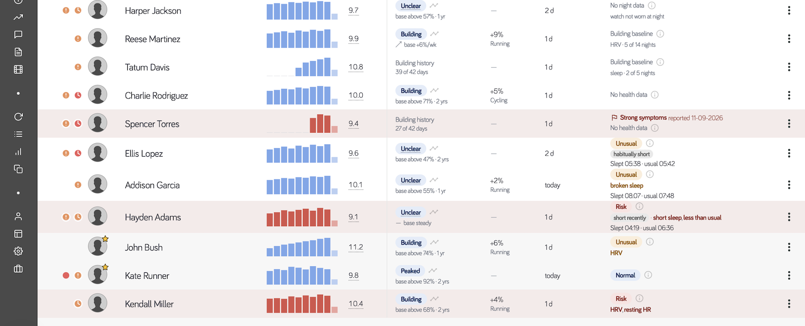
Reading that column from the top: a watch not worn at night, two Building baseline counters — one counting HRV nights, one counting sleep nights, and the two counts differ because the two measurements need different numbers of them — an athlete with no health data at all, a red flag line where the athlete reported strong symptoms themselves, an Unusual on a habitually short sleeper with the hours and their usual printed beside it, a Risk carrying three sleep reasons at once, and a Risk where HRV and resting heart rate moved together.
Nothing is ever coloured as an achievement. Normal is neutral: it says nothing stood out, not that the athlete is fresh, and there is no level above it. Every cell, including every absence, carries an ⓘ button that opens the measurements behind it without loading anything.
Building baseline and No night data look alike and mean the opposite: the first says wait, the second says waiting will not help — the watch is not being worn overnight, or the source has stopped.
A Risk badge beside an ordinary rTFF and a Building cardio state is the case this column exists for: the training is fine, the athlete is not. The reverse — a hard block with clean overnight numbers — is an athlete absorbing it well, and is deliberately not flagged.
Full explanation, thresholds and the research behind them →
Reading one row
Each column answers a narrower question than the row does. The row is read left to right, and the answer is the combination. From the roster at the top of this page:
Bars climbing week on week, rTFF 12.1, cardio state Overreaching, a +11% running ramp, a workout today, readiness Unusual · resting HR.
Four columns are saying the same thing there, and that agreement is what makes it worth acting on: the training has been rising, the model says the athlete is carrying more recent cost than the base supports, the structural load is climbing with it, and the body agreed overnight. Any one of those alone is ordinary — a hard week is usually the week you wrote.
The combinations worth learning are the ones that mean the opposite of how they first read.
Five more rows worth recognising
A hard block being absorbed. Bars climbing, rTFF above its band, a modest ramp, cardio state Building, readiness Normal. Four columns and nothing to do: the athlete is taking the work you gave them. This is deliberately not flagged — a filter that fires on a build that is going well is a filter you stop reading.
The mountain week. Cardio state Unclear with the base steady, a +62% ramp, readiness Normal, and the bars flat or falling. Nothing looks wrong, and the legs took the heaviest week of the year. Hills and trails lower heart rate for the same effort, so cardio load falls while structural load climbs — the one case this pair of columns exists to catch. Ease next week's descending volume, not the cardio.
The athlete who stopped. Cardio state Unclear, rTFF 0.0, last workout 9d, base still above the 91st percentile. The reading was going to be Peaked — a fortnight of silence looks exactly like a taper that worked — so the app withdraws it and says the useful thing instead. The base is real; the silence is what to ask about.
The base that eroded. Detrained, rTFF 0.0, last workout 11d, bars shrinking to a hairline. The same silence, a different story: here the base has gone with it. Before you plan a conversation, check the athlete is still syncing — a broken integration produces this row exactly.
A bad night on a plan that is fine. Cardio state Building, rTFF inside its band, a small ramp, readiness Risk · HRV, resting HR. The training is fine; the athlete is not. Both autonomic measurements moved together, which is what illness and sleep debt look like a day or two before anyone mentions them. Open the ⓘ and see how far from their own normal they are before deciding anything.
Needs attention
A filter beside Unread and Without plans, shown only in this mode. It selects athletes matching any of:
- the athlete reported illness, pain or more than ordinary fatigue themselves,
- readiness Risk, including a Risk caused by the watch's own morning reading,
- cardio state Detrained or Overreaching,
- a structural ramp above the 10% rule together with a positive cardio state,
- no completed workout for 7 days or more.
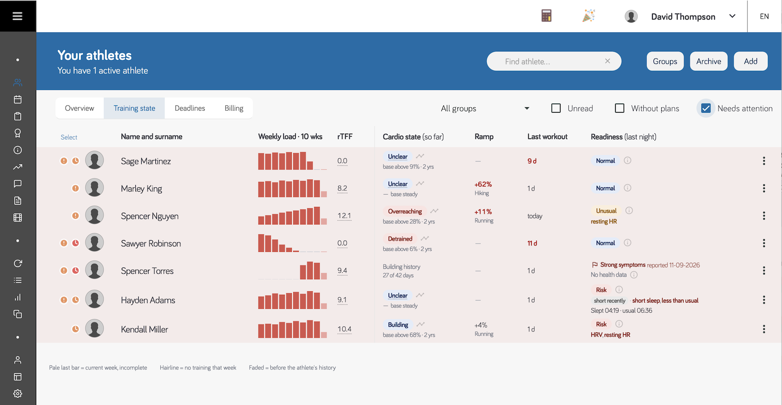
With the filter on, the roster drops to the rows that matched, and each still shows which trigger caught it: a nine-day gap since the last workout, a +62% ramp on an athlete reading fresh, Overreaching, Detrained, an athlete who reported strong symptoms, and two readiness Risk rows. Seven rows out of a full list is the size this filter should be. If it selects half your roster, one of the triggers is miscalibrated — which is exactly what happened to rTFF.
Flagged athletes are tinted across the whole row and their bars change colour, so they are visible before you read a single column. Hover the weekly load bars of a flagged row and it lists what triggered it — one line per reason, ordered from what needs no interpretation to be true down to what needs the most, so the first line is always the one that best explains the row. A row can carry more than one, and a row carrying two is worth more of your time than either alone.
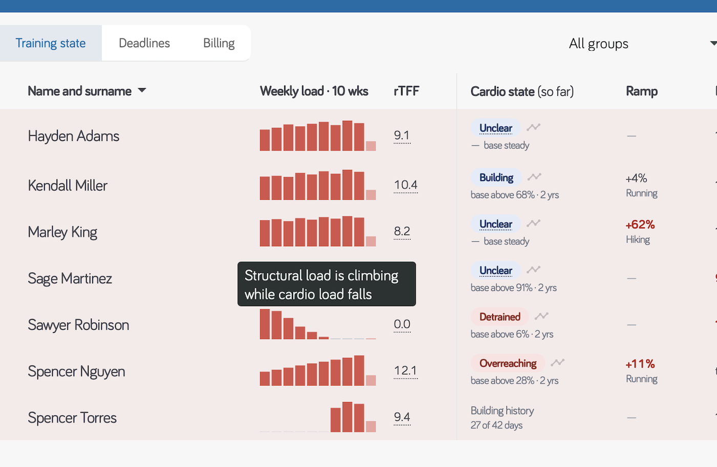
The row hovered above is the mountain-week case: a +62% hiking ramp on an athlete whose cardio state reads Unclear. The tooltip gives the reason as a sentence rather than the name of a rule, so you can disagree with it — which is the point of listing reasons at all.
Deliberately not flagged: a clean taper, a high ramp during a build, an athlete still building history, an athlete with no health data, a single readiness measurement moving on its own, and a habitually short sleeper. A filter that fires on a correct taper is one coaches stop trusting — and a chronically short sleeper would sit in it every morning for ever, until the other triggers there lost their meaning.
The self-report trigger is the one with no threshold behind it, and that is the point: nothing about it can be miscalibrated, and it is the only trigger that reaches the athletes who have no watch at all.
A hard week on its own is not on the list, and used to be. rTFF above its band was a trigger until it turned out to be flagging nearly half a roster — and on its own it usually describes the plan you wrote. What matters about a hard week is already caught: on an eroding base it is Detrained, with an elevated ramp it is the conjunction above, after a poor night it is Risk.
While the list is loading
Metrics are fetched for the rows on screen as you scroll, a batch at a time, rather than for the whole club at once — on a large roster that is the difference between one request and a dozen.
- Grey placeholder bars — the metrics for that row are on their way.
- Calculating… — the roster arrived; that athlete's cardio state is still being computed. It fills in on its own within a few seconds.
- Not connected yet — an invited athlete who has not accepted. There is nothing to show, and nothing is being waited for.
Scrolling back to rows you have already seen costs nothing; the figures stay loaded until the list refreshes.
When something is missing
Most questions about this view are about a cell that is empty, and almost all of them have their answer in the cell itself. These are the ones worth writing down.
Why is rTFF blank for this athlete? They have fewer than 21 days of history with you, or they have the history and almost no training in it. rTFF divides this week by what the last three weeks built, and for a newer athlete most of that divisor is days before they existed — the number that comes out is an artefact of the missing weeks, not a reading. It fills in by itself.
Why is the Ramp column empty? Because nothing is rising. A decline is not a ramp, and that the athlete is doing less is already said by the bars, by the days since the last workout and by the cardio state. An empty ramp is a normal, healthy cell.
Why does the cardio state say Building history? Fewer than 42 days of training. Cardio form is a comparison against the athlete's own base, and before 42 days there is no base to compare with. The cell counts the days, so you can see how far off it is.
Why does an athlete have no readiness at all? Either no watch is connected, or one is connected and not worn overnight. Readiness reads night HRV, night resting heart rate and sleep, none of which exist unless the watch is on the wrist while the athlete sleeps. No health data and No night data are those two different cases — and an athlete whose data arrives through Strava will always show the first.
What is the difference between Building baseline and No night data? They look alike and mean the opposite. Building baseline says wait: nights are arriving and the counter is climbing. No night data says waiting will change nothing — the fix is at the athlete's end, today.
Why did a value change between this morning and this afternoon? Because every column is calculated up to now. A reading taken at 08:00 assumes the athlete does nothing else that day, and a session arriving at lunchtime changes it. Nothing is final until the day is over.
A row says Calculating… — is it stuck? Almost certainly not. Cardio state, Ramp and Training fatigue are rebuilt from the athlete's whole history, so after a new session arrives they take a few seconds to catch up. Everything else on that row is already current.
An athlete I am worried about is not in Needs attention. Why not? The filter fires on five specific things, and a hard week on its own is deliberately not one of them — it used to be, and it flagged nearly half a roster while usually describing the plan the coach had written. The list is a floor, not a ceiling: it is there so that nothing is missed, not so that everything else can be ignored.
The Training state mode is available in the browser app. The mobile apps show the athletes list without it.